
Plotting Comparative Covid-19 Incidence with ggplot2
Motivation
Covid-19 - the bug that won’t go away. It’s hard to believe we’ve been here for over 2 years. Perhaps like you, I went from checking the Epi curves daily back in 2019, to loneliness and pandemic fatigue, to baking sourdough and planting stuff, to kind of, sort of, almost going back to normal. And then… Omicron. So here we are, back in the familiar bubble.
Speaking of Epi curves, it’s very easy to make one of your own - certainly easier than sourdough starter. Here’s one using ggplot2 and the Covid-19 global dataset maintained by Our World in Data, OWID. OWID compiles this dataset from several sources including the Center for Systems Science and Engineering (CSSE) at Johns Hopkins University, national government reports, and the Human Mortality Database (2021).
library(tidyverse)Data Preparation
First, let’s import and examine the .csv from the “Our World in Data” Github repo.
raw_data = read.csv("./data//owid-covid-data.csv")
str(raw_data)
## 'data.frame': 157936 obs. of 67 variables:
## $ iso_code : chr "AFG" "AFG" "AFG" "AFG" ...
## $ continent : chr "Asia" "Asia" "Asia" "Asia" ...
## $ location : chr "Afghanistan" "Afghanistan" "Afghanistan" "Afghanistan" ...
## $ date : chr "2020-02-24" "2020-02-25" "2020-02-26" "2020-02-27" ...
## $ total_cases : num 5 5 5 5 5 5 5 5 5 5 ...
## $ new_cases : num 5 0 0 0 0 0 0 0 0 0 ...
## $ new_cases_smoothed : num NA NA NA NA NA 0.714 0.714 0 0 0 ...
## $ total_deaths : num NA NA NA NA NA NA NA NA NA NA ...
## $ new_deaths : num NA NA NA NA NA NA NA NA NA NA ...
## $ new_deaths_smoothed : num NA NA NA NA NA NA NA NA NA NA ...
## $ total_cases_per_million : num 0.126 0.126 0.126 0.126 0.126 0.126 0.126 0.126 0.126 0.126 ...
## $ new_cases_per_million : num 0.126 0 0 0 0 0 0 0 0 0 ...
## $ new_cases_smoothed_per_million : num NA NA NA NA NA 0.018 0.018 0 0 0 ...
## $ total_deaths_per_million : num NA NA NA NA NA NA NA NA NA NA ...
## $ new_deaths_per_million : num NA NA NA NA NA NA NA NA NA NA ...
## $ new_deaths_smoothed_per_million : num NA NA NA NA NA NA NA NA NA NA ...
## $ reproduction_rate : num NA NA NA NA NA NA NA NA NA NA ...
## $ icu_patients : num NA NA NA NA NA NA NA NA NA NA ...
## $ icu_patients_per_million : num NA NA NA NA NA NA NA NA NA NA ...
## $ hosp_patients : num NA NA NA NA NA NA NA NA NA NA ...
## $ hosp_patients_per_million : num NA NA NA NA NA NA NA NA NA NA ...
## $ weekly_icu_admissions : num NA NA NA NA NA NA NA NA NA NA ...
## $ weekly_icu_admissions_per_million : num NA NA NA NA NA NA NA NA NA NA ...
## $ weekly_hosp_admissions : num NA NA NA NA NA NA NA NA NA NA ...
## $ weekly_hosp_admissions_per_million : num NA NA NA NA NA NA NA NA NA NA ...
## $ new_tests : num NA NA NA NA NA NA NA NA NA NA ...
## $ total_tests : num NA NA NA NA NA NA NA NA NA NA ...
## $ total_tests_per_thousand : num NA NA NA NA NA NA NA NA NA NA ...
## $ new_tests_per_thousand : num NA NA NA NA NA NA NA NA NA NA ...
## $ new_tests_smoothed : num NA NA NA NA NA NA NA NA NA NA ...
## $ new_tests_smoothed_per_thousand : num NA NA NA NA NA NA NA NA NA NA ...
## $ positive_rate : num NA NA NA NA NA NA NA NA NA NA ...
## $ tests_per_case : num NA NA NA NA NA NA NA NA NA NA ...
## $ tests_units : chr "" "" "" "" ...
## $ total_vaccinations : num NA NA NA NA NA NA NA NA NA NA ...
## $ people_vaccinated : num NA NA NA NA NA NA NA NA NA NA ...
## $ people_fully_vaccinated : num NA NA NA NA NA NA NA NA NA NA ...
## $ total_boosters : num NA NA NA NA NA NA NA NA NA NA ...
## $ new_vaccinations : num NA NA NA NA NA NA NA NA NA NA ...
## $ new_vaccinations_smoothed : num NA NA NA NA NA NA NA NA NA NA ...
## $ total_vaccinations_per_hundred : num NA NA NA NA NA NA NA NA NA NA ...
## $ people_vaccinated_per_hundred : num NA NA NA NA NA NA NA NA NA NA ...
## $ people_fully_vaccinated_per_hundred : num NA NA NA NA NA NA NA NA NA NA ...
## $ total_boosters_per_hundred : num NA NA NA NA NA NA NA NA NA NA ...
## $ new_vaccinations_smoothed_per_million : num NA NA NA NA NA NA NA NA NA NA ...
## $ new_people_vaccinated_smoothed : num NA NA NA NA NA NA NA NA NA NA ...
## $ new_people_vaccinated_smoothed_per_hundred: num NA NA NA NA NA NA NA NA NA NA ...
## $ stringency_index : num 8.33 8.33 8.33 8.33 8.33 ...
## $ population : num 39835428 39835428 39835428 39835428 39835428 ...
## $ population_density : num 54.4 54.4 54.4 54.4 54.4 ...
## $ median_age : num 18.6 18.6 18.6 18.6 18.6 18.6 18.6 18.6 18.6 18.6 ...
## $ aged_65_older : num 2.58 2.58 2.58 2.58 2.58 ...
## $ aged_70_older : num 1.34 1.34 1.34 1.34 1.34 ...
## $ gdp_per_capita : num 1804 1804 1804 1804 1804 ...
## $ extreme_poverty : num NA NA NA NA NA NA NA NA NA NA ...
## $ cardiovasc_death_rate : num 597 597 597 597 597 ...
## $ diabetes_prevalence : num 9.59 9.59 9.59 9.59 9.59 9.59 9.59 9.59 9.59 9.59 ...
## $ female_smokers : num NA NA NA NA NA NA NA NA NA NA ...
## $ male_smokers : num NA NA NA NA NA NA NA NA NA NA ...
## $ handwashing_facilities : num 37.7 37.7 37.7 37.7 37.7 ...
## $ hospital_beds_per_thousand : num 0.5 0.5 0.5 0.5 0.5 0.5 0.5 0.5 0.5 0.5 ...
## $ life_expectancy : num 64.8 64.8 64.8 64.8 64.8 ...
## $ human_development_index : num 0.511 0.511 0.511 0.511 0.511 0.511 0.511 0.511 0.511 0.511 ...
## $ excess_mortality_cumulative_absolute : num NA NA NA NA NA NA NA NA NA NA ...
## $ excess_mortality_cumulative : num NA NA NA NA NA NA NA NA NA NA ...
## $ excess_mortality : num NA NA NA NA NA NA NA NA NA NA ...
## $ excess_mortality_cumulative_per_million : num NA NA NA NA NA NA NA NA NA NA ...head(raw_data)## iso_code continent location date total_cases new_cases
## 1 AFG Asia Afghanistan 2020-02-24 5 5
## 2 AFG Asia Afghanistan 2020-02-25 5 0
## 3 AFG Asia Afghanistan 2020-02-26 5 0
## 4 AFG Asia Afghanistan 2020-02-27 5 0
## 5 AFG Asia Afghanistan 2020-02-28 5 0
## 6 AFG Asia Afghanistan 2020-02-29 5 0
## new_cases_smoothed total_deaths new_deaths new_deaths_smoothed
## 1 NA NA NA NA
## 2 NA NA NA NA
## 3 NA NA NA NA
## 4 NA NA NA NA
## 5 NA NA NA NA
## 6 0.714 NA NA NA
## total_cases_per_million new_cases_per_million new_cases_smoothed_per_million
## 1 0.126 0.126 NA
## 2 0.126 0.000 NA
## 3 0.126 0.000 NA
## 4 0.126 0.000 NA
## 5 0.126 0.000 NA
## 6 0.126 0.000 0.018
## total_deaths_per_million new_deaths_per_million
## 1 NA NA
## 2 NA NA
## 3 NA NA
## 4 NA NA
## 5 NA NA
## 6 NA NA
## new_deaths_smoothed_per_million reproduction_rate icu_patients
## 1 NA NA NA
## 2 NA NA NA
## 3 NA NA NA
## 4 NA NA NA
## 5 NA NA NA
## 6 NA NA NA
## icu_patients_per_million hosp_patients hosp_patients_per_million
## 1 NA NA NA
## 2 NA NA NA
## 3 NA NA NA
## 4 NA NA NA
## 5 NA NA NA
## 6 NA NA NA
## weekly_icu_admissions weekly_icu_admissions_per_million
## 1 NA NA
## 2 NA NA
## 3 NA NA
## 4 NA NA
## 5 NA NA
## 6 NA NA
## weekly_hosp_admissions weekly_hosp_admissions_per_million new_tests
## 1 NA NA NA
## 2 NA NA NA
## 3 NA NA NA
## 4 NA NA NA
## 5 NA NA NA
## 6 NA NA NA
## total_tests total_tests_per_thousand new_tests_per_thousand
## 1 NA NA NA
## 2 NA NA NA
## 3 NA NA NA
## 4 NA NA NA
## 5 NA NA NA
## 6 NA NA NA
## new_tests_smoothed new_tests_smoothed_per_thousand positive_rate
## 1 NA NA NA
## 2 NA NA NA
## 3 NA NA NA
## 4 NA NA NA
## 5 NA NA NA
## 6 NA NA NA
## tests_per_case tests_units total_vaccinations people_vaccinated
## 1 NA NA NA
## 2 NA NA NA
## 3 NA NA NA
## 4 NA NA NA
## 5 NA NA NA
## 6 NA NA NA
## people_fully_vaccinated total_boosters new_vaccinations
## 1 NA NA NA
## 2 NA NA NA
## 3 NA NA NA
## 4 NA NA NA
## 5 NA NA NA
## 6 NA NA NA
## new_vaccinations_smoothed total_vaccinations_per_hundred
## 1 NA NA
## 2 NA NA
## 3 NA NA
## 4 NA NA
## 5 NA NA
## 6 NA NA
## people_vaccinated_per_hundred people_fully_vaccinated_per_hundred
## 1 NA NA
## 2 NA NA
## 3 NA NA
## 4 NA NA
## 5 NA NA
## 6 NA NA
## total_boosters_per_hundred new_vaccinations_smoothed_per_million
## 1 NA NA
## 2 NA NA
## 3 NA NA
## 4 NA NA
## 5 NA NA
## 6 NA NA
## new_people_vaccinated_smoothed new_people_vaccinated_smoothed_per_hundred
## 1 NA NA
## 2 NA NA
## 3 NA NA
## 4 NA NA
## 5 NA NA
## 6 NA NA
## stringency_index population population_density median_age aged_65_older
## 1 8.33 39835428 54.422 18.6 2.581
## 2 8.33 39835428 54.422 18.6 2.581
## 3 8.33 39835428 54.422 18.6 2.581
## 4 8.33 39835428 54.422 18.6 2.581
## 5 8.33 39835428 54.422 18.6 2.581
## 6 8.33 39835428 54.422 18.6 2.581
## aged_70_older gdp_per_capita extreme_poverty cardiovasc_death_rate
## 1 1.337 1803.987 NA 597.029
## 2 1.337 1803.987 NA 597.029
## 3 1.337 1803.987 NA 597.029
## 4 1.337 1803.987 NA 597.029
## 5 1.337 1803.987 NA 597.029
## 6 1.337 1803.987 NA 597.029
## diabetes_prevalence female_smokers male_smokers handwashing_facilities
## 1 9.59 NA NA 37.746
## 2 9.59 NA NA 37.746
## 3 9.59 NA NA 37.746
## 4 9.59 NA NA 37.746
## 5 9.59 NA NA 37.746
## 6 9.59 NA NA 37.746
## hospital_beds_per_thousand life_expectancy human_development_index
## 1 0.5 64.83 0.511
## 2 0.5 64.83 0.511
## 3 0.5 64.83 0.511
## 4 0.5 64.83 0.511
## 5 0.5 64.83 0.511
## 6 0.5 64.83 0.511
## excess_mortality_cumulative_absolute excess_mortality_cumulative
## 1 NA NA
## 2 NA NA
## 3 NA NA
## 4 NA NA
## 5 NA NA
## 6 NA NA
## excess_mortality excess_mortality_cumulative_per_million
## 1 NA NA
## 2 NA NA
## 3 NA NA
## 4 NA NA
## 5 NA NA
## 6 NA NAThe dataset is clean and in wide format. Countries are contained in the location variable (with corresponding values for iso_code given), and we have daily values for quite a few variables including new_cases (we’ll use this to plot disease incidence), new_cases_per_million, new_tests, total_vaccinations and booster data is now available as total_boosters.
Analysis
Let’s first plot disease incidence using the new_cases variable.
us_data =
  raw_data %>%
  filter(location == "United States") %>%
  mutate(date = as.Date(date))

ggplot(us_data, aes(x = date, y = new_cases)) +
  geom_point()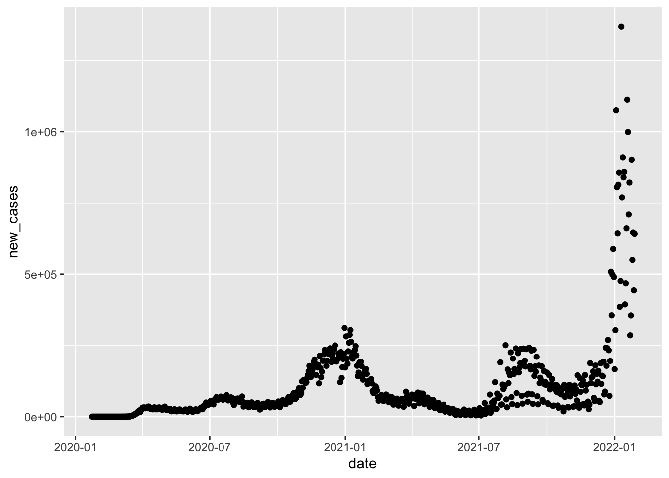
It looks a little crazy, almost like there are several superimposed curves. What’s really happening is that we’re seeing a lot of noise from day-to-day fluctuation. Data aren’t reported uniformly, so it’s not uncommon to observe a “spike” in reports on, say, Mondays when reporting for the weekend is done.
For this reason, we used smoothed data, usually amounting to a 7-day average. This technique allows us to eliminate the noise attributable to reporting fluctuations through the week. OWID gives us a smoothed version of new_cases which achieves just that.
us_plot =
  ggplot(us_data, aes(x = date, y = new_cases_smoothed)) +
  geom_point() +
  labs(title = "Covid-19 Incidence in the United States")

us_plot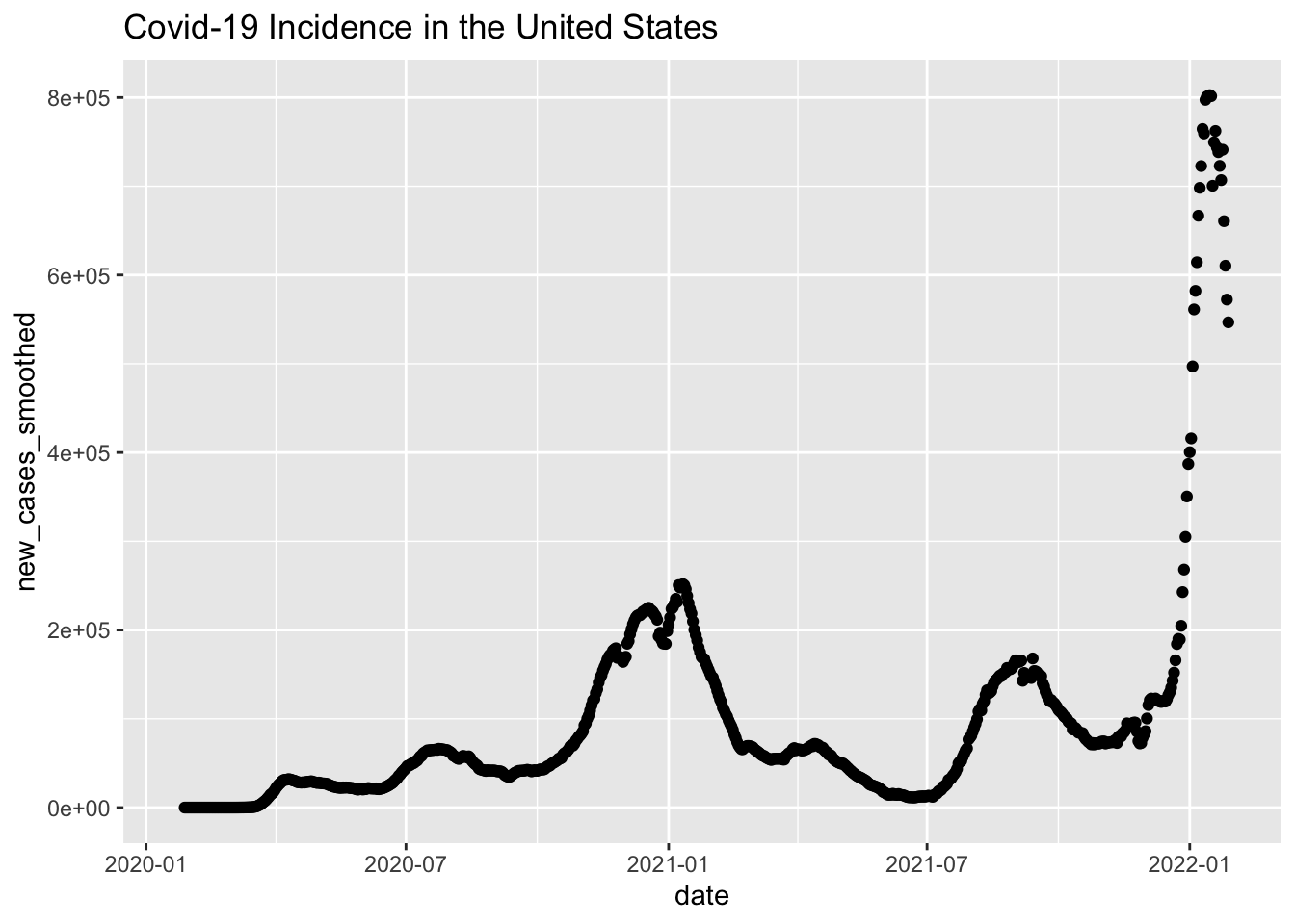
Much better. Let’s now compare the US to a few other (arbitrarily chosen) countries. Here’s Peru.
peru_plot =
  raw_data %>%
  filter(location == "Peru") %>%
  mutate(date = as.Date(date)) %>%
  ggplot(aes(x = date, y = new_cases_smoothed)) +
  geom_point() +
  labs(title = "Covid-19 Incidence in Peru")

peru_plot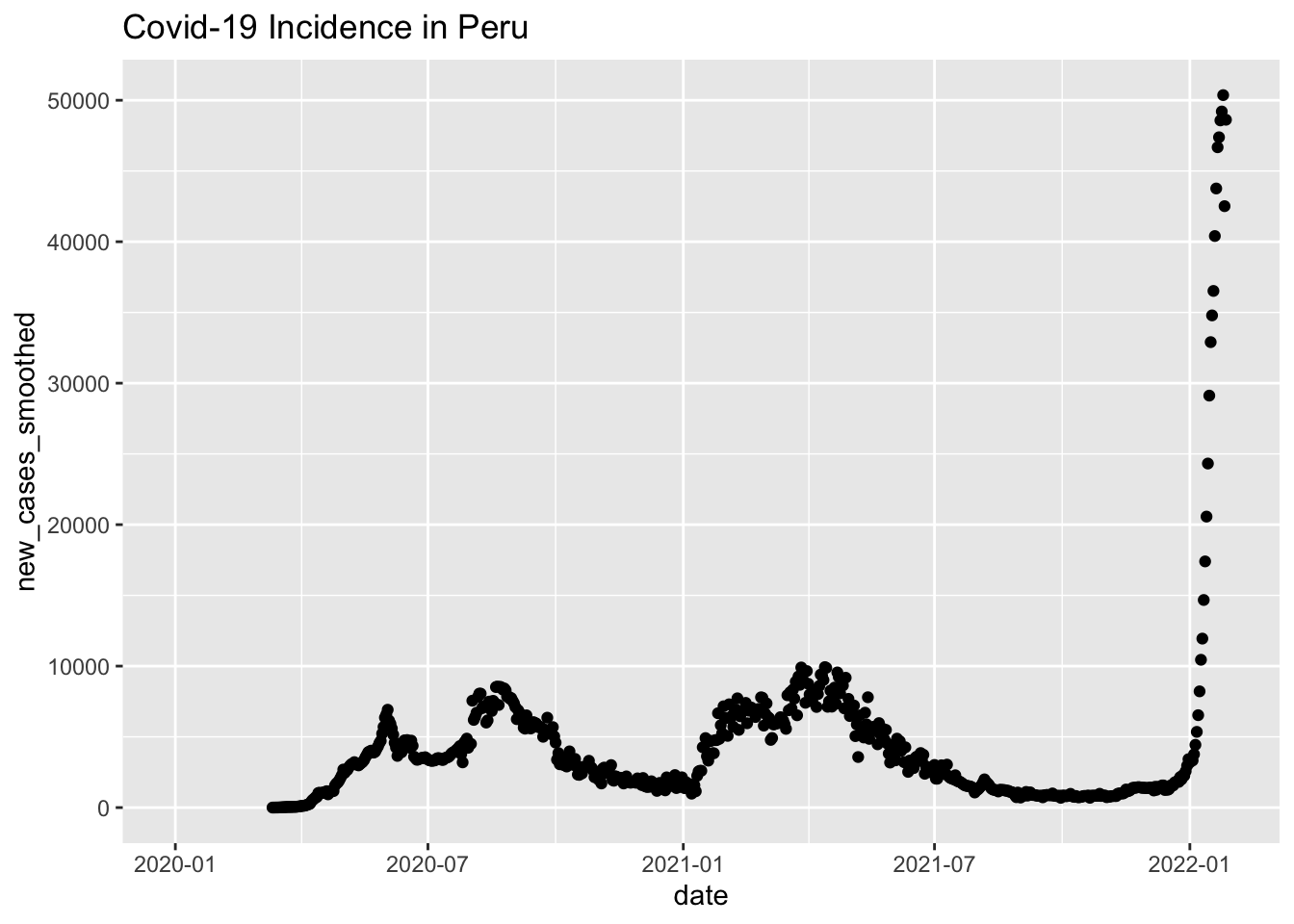
And here’s Japan.
japan_plot =
  raw_data %>%
  filter(location == "Japan") %>%
  mutate(date = as.Date(date)) %>%
  ggplot(aes(x = date, y = new_cases_smoothed)) +
  geom_point() +
  labs(title = "Covid-19 Incidence in Japan")

japan_plot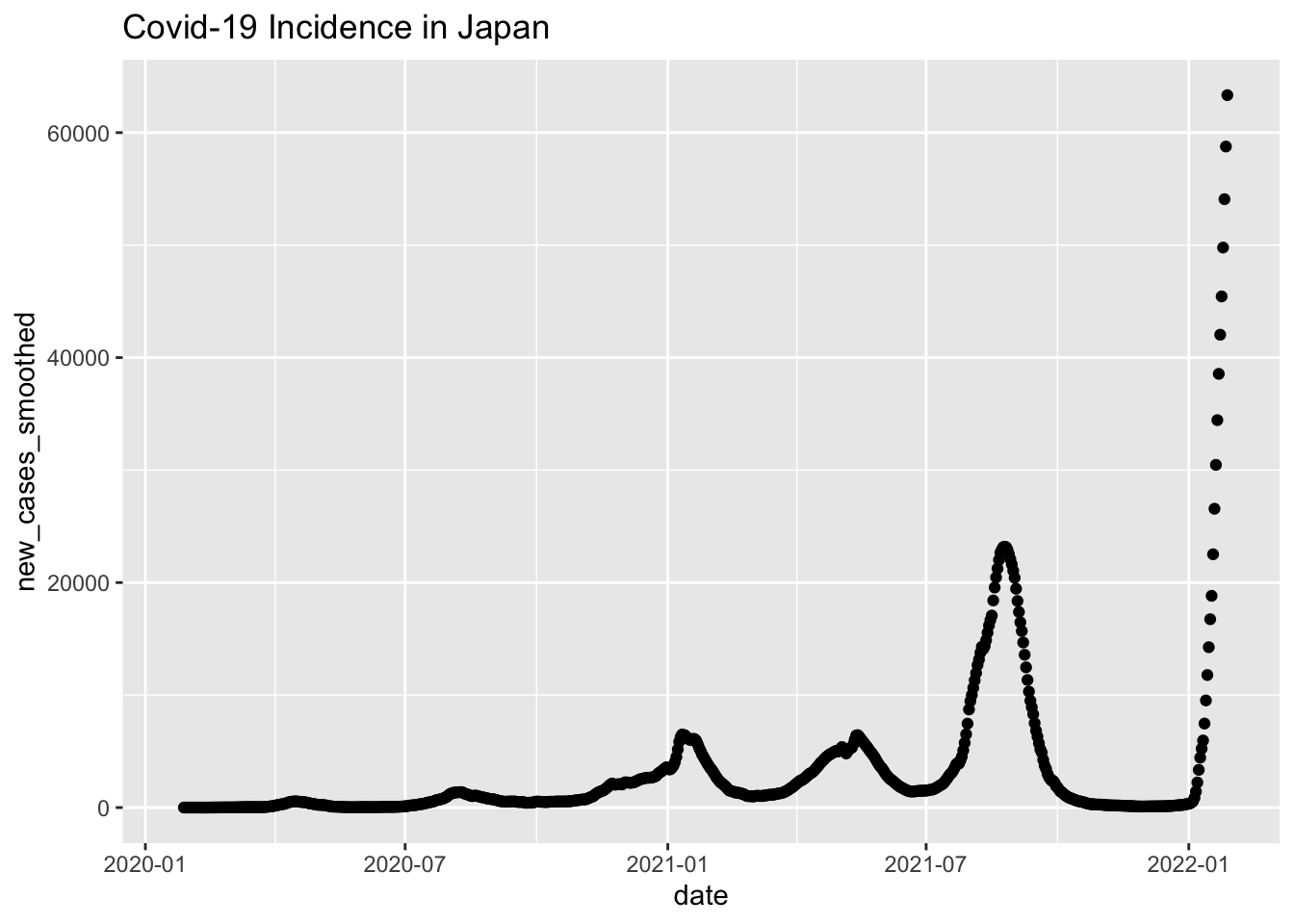
Here’s Australia.
aus_plot =
  raw_data %>%
  filter(location == "Australia") %>%
  mutate(date = as.Date(date)) %>%
  ggplot(aes(x = date, y = new_cases_smoothed)) +
  geom_point() +
  labs(title = "Covid-19 Incidence in Australia")

aus_plot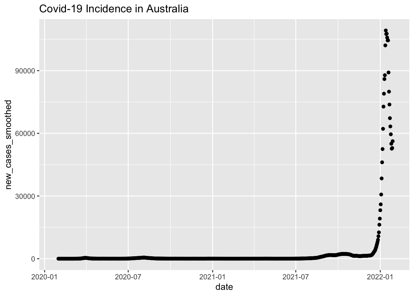
Here’s Zimbabwe.
zimbabwe_plot =
  raw_data %>%
  filter(location == "Zimbabwe") %>%
  mutate(date = as.Date(date)) %>%
  ggplot(aes(x = date, y = new_cases_smoothed)) +
  geom_point() +
  labs(title = "Covid-19 Incidence in Zimbabwe")

zimbabwe_plot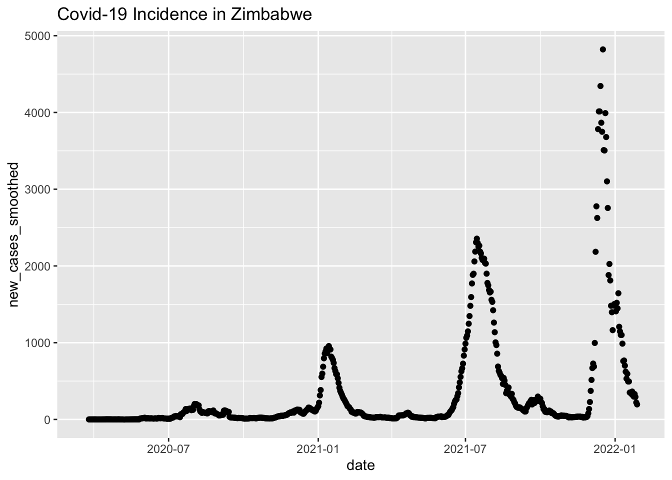
Finally, here’s Turkey.
turkey_plot =
  raw_data %>%
  filter(location == "Turkey") %>%
  mutate(date = as.Date(date)) %>%
  ggplot(aes(x = date, y = new_cases_smoothed)) +
  geom_point() +
  labs(title = "Covid-19 Incidence in Turkey")

turkey_plot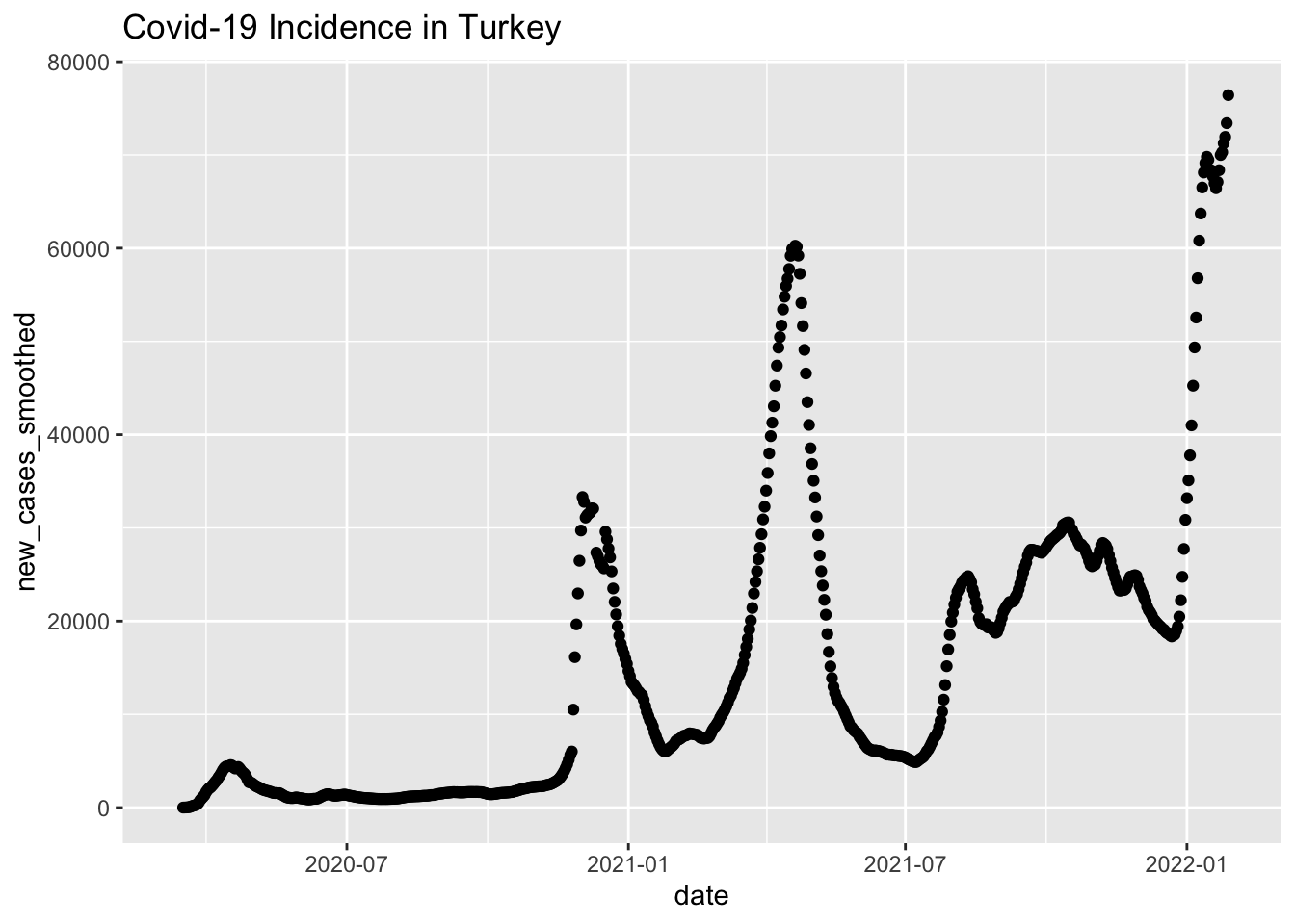
It’s evident that Omicron has a foothold all over the world, but to really compare the penetration we’ll need to scale the case loads to the population. Again, OWID gives us a variable where cases/population is already calculated: new_cases_per_million and new_cases_smoothed_per_million. We’ll used the smoothed version and combine the incidence of all six countries onto one plot.
combined_plot =
  raw_data %>%
  filter(location %in% c("United States", "Peru", "Japan", "Australia", "Zimbabwe", "Turkey")) %>%
  mutate(date = as.Date(date)) %>%
  ggplot(aes(x = date, y = new_cases_smoothed_per_million, group = location)) +
  geom_line(aes(color = location))

combined_plot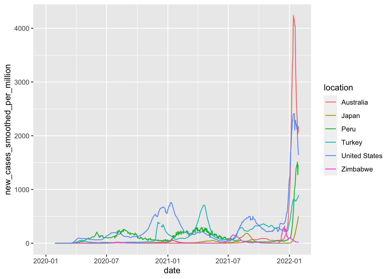
Interestingly, Australia has had the highest Omicron peak, almost double that of the US. This is particularly unfortunate, given Australia’s ultra-high vaccination rate.
Now, having learned something, let’s polish up the curves.
final_plot =
  combined_plot +
  labs(title = "Covid-19 Incidence in Australia, Japan, Peru, Turkey, the United States, and Zimbabwe, Cases per Million, Smoothed 7-Day Average",
       x = "Date",
       y = "Cases per Million")

final_plot + theme_minimal()
Conclusion
While you can certainly just google Covid-19 in any country that interests you, getting to an accurate, scaled comparison between countries probably requires a bit more effort. Thankfully, Our World in Data and ggplot2 make the task entirely painless.


