
Modeling Global Life Expectancy vs Education using Least Squares Regression
Motivation
In the context of ordinary least squares regression (OLS), the word “ordinary” implies that it’s mundane and uninteresting. But honestly, when I first learned the mechanics of OLS in an intro stats class, I found it incredibly insightful. It fascinated me that there is so much data being collected and analyzed by super powerful computers and being passed into fancy machine learning models that can literally predict the future. And yet, when you really dig down and get to the fundamentals, the true beginning, all it really comes from is distances between points.
In this post, we’ll explore the mechanics of ordinary least squares regression using global data on life expectancy collected by the World Health Organization. We’ll get down to some bare-bones concepts of regression modeling, analyze model diagnostics, compare two models, and attempt to validate the assumptions for performing linear regression in the first place.
Data Preparation
Data Source
We’ll be using the WHO’s life expectancy dataset, found on Kaggle here.
Libraries
library(tidyverse)
library(skimr)
library(broom)

theme_set(theme_bw())
Data Import and Tidy
Reading in and having a quick look at the dataset:
lifexp_df <-
  read.csv(file = "./data/who_life_expectancy.csv") %>%
  janitor::clean_names()

glimpse(lifexp_df)
## Rows: 2,938
## Columns: 22
## $ country <chr> "Afghanistan", "Afghanistan", "Afghani…
## $ year <int> 2015, 2014, 2013, 2012, 2011, 2010, 20…
## $ status <chr> "Developing", "Developing", "Developin…
## $ life_expectancy <dbl> 65.0, 59.9, 59.9, 59.5, 59.2, 58.8, 58…
## $ adult_mortality <int> 263, 271, 268, 272, 275, 279, 281, 287…
## $ infant_deaths <int> 62, 64, 66, 69, 71, 74, 77, 80, 82, 84…
## $ alcohol <dbl> 0.01, 0.01, 0.01, 0.01, 0.01, 0.01, 0.…
## $ percentage_expenditure <dbl> 71.279624, 73.523582, 73.219243, 78.18…
## $ hepatitis_b <int> 65, 62, 64, 67, 68, 66, 63, 64, 63, 64…
## $ measles <int> 1154, 492, 430, 2787, 3013, 1989, 2861…
## $ bmi <dbl> 19.1, 18.6, 18.1, 17.6, 17.2, 16.7, 16…
## $ under_five_deaths <int> 83, 86, 89, 93, 97, 102, 106, 110, 113…
## $ polio <int> 6, 58, 62, 67, 68, 66, 63, 64, 63, 58,…
## $ total_expenditure <dbl> 8.16, 8.18, 8.13, 8.52, 7.87, 9.20, 9.…
## $ diphtheria <int> 65, 62, 64, 67, 68, 66, 63, 64, 63, 58…
## $ hiv_aids <dbl> 0.1, 0.1, 0.1, 0.1, 0.1, 0.1, 0.1, 0.1…
## $ gdp <dbl> 584.25921, 612.69651, 631.74498, 669.9…
## $ population <dbl> 33736494, 327582, 31731688, 3696958, 2…
## $ thinness_1_19_years <dbl> 17.2, 17.5, 17.7, 17.9, 18.2, 18.4, 18…
## $ thinness_5_9_years <dbl> 17.3, 17.5, 17.7, 18.0, 18.2, 18.4, 18…
## $ income_composition_of_resources <dbl> 0.479, 0.476, 0.470, 0.463, 0.454, 0.4…
## $ schooling <dbl> 10.1, 10.0, 9.9, 9.8, 9.5, 9.2, 8.9, 8…skim(lifexp_df)| Name | lifexp_df |
| Number of rows | 2938 |
| Number of columns | 22 |
| _______________________ | |
| Column type frequency: | |
| character | 2 |
| numeric | 20 |
| ________________________ | |
| Group variables | None |
Variable type: character
| skim_variable | n_missing | complete_rate | min | max | empty | n_unique | whitespace |
|---|---|---|---|---|---|---|---|
| country | 0 | 1 | 4 | 52 | 0 | 193 | 0 |
| status | 0 | 1 | 9 | 10 | 0 | 2 | 0 |
Variable type: numeric
| skim_variable | n_missing | complete_rate | mean | sd | p0 | p25 | p50 | p75 | p100 | hist |
|---|---|---|---|---|---|---|---|---|---|---|
| year | 0 | 1.00 | 2007.52 | 4.61 | 2000.00 | 2004.00 | 2008.00 | 2012.00 | 2.015000e+03 | ▇▆▆▆▆ |
| life_expectancy | 10 | 1.00 | 69.22 | 9.52 | 36.30 | 63.10 | 72.10 | 75.70 | 8.900000e+01 | ▁▂▃▇▂ |
| adult_mortality | 10 | 1.00 | 164.80 | 124.29 | 1.00 | 74.00 | 144.00 | 228.00 | 7.230000e+02 | ▇▆▂▁▁ |
| infant_deaths | 0 | 1.00 | 30.30 | 117.93 | 0.00 | 0.00 | 3.00 | 22.00 | 1.800000e+03 | ▇▁▁▁▁ |
| alcohol | 194 | 0.93 | 4.60 | 4.05 | 0.01 | 0.88 | 3.76 | 7.70 | 1.787000e+01 | ▇▃▃▂▁ |
| percentage_expenditure | 0 | 1.00 | 738.25 | 1987.91 | 0.00 | 4.69 | 64.91 | 441.53 | 1.947991e+04 | ▇▁▁▁▁ |
| hepatitis_b | 553 | 0.81 | 80.94 | 25.07 | 1.00 | 77.00 | 92.00 | 97.00 | 9.900000e+01 | ▁▁▁▂▇ |
| measles | 0 | 1.00 | 2419.59 | 11467.27 | 0.00 | 0.00 | 17.00 | 360.25 | 2.121830e+05 | ▇▁▁▁▁ |
| bmi | 34 | 0.99 | 38.32 | 20.04 | 1.00 | 19.30 | 43.50 | 56.20 | 8.730000e+01 | ▅▅▅▇▁ |
| under_five_deaths | 0 | 1.00 | 42.04 | 160.45 | 0.00 | 0.00 | 4.00 | 28.00 | 2.500000e+03 | ▇▁▁▁▁ |
| polio | 19 | 0.99 | 82.55 | 23.43 | 3.00 | 78.00 | 93.00 | 97.00 | 9.900000e+01 | ▁▁▁▂▇ |
| total_expenditure | 226 | 0.92 | 5.94 | 2.50 | 0.37 | 4.26 | 5.76 | 7.49 | 1.760000e+01 | ▃▇▃▁▁ |
| diphtheria | 19 | 0.99 | 82.32 | 23.72 | 2.00 | 78.00 | 93.00 | 97.00 | 9.900000e+01 | ▁▁▁▂▇ |
| hiv_aids | 0 | 1.00 | 1.74 | 5.08 | 0.10 | 0.10 | 0.10 | 0.80 | 5.060000e+01 | ▇▁▁▁▁ |
| gdp | 448 | 0.85 | 7483.16 | 14270.17 | 1.68 | 463.94 | 1766.95 | 5910.81 | 1.191727e+05 | ▇▁▁▁▁ |
| population | 652 | 0.78 | 12753375.12 | 61012096.51 | 34.00 | 195793.25 | 1386542.00 | 7420359.00 | 1.293859e+09 | ▇▁▁▁▁ |
| thinness_1_19_years | 34 | 0.99 | 4.84 | 4.42 | 0.10 | 1.60 | 3.30 | 7.20 | 2.770000e+01 | ▇▃▁▁▁ |
| thinness_5_9_years | 34 | 0.99 | 4.87 | 4.51 | 0.10 | 1.50 | 3.30 | 7.20 | 2.860000e+01 | ▇▃▁▁▁ |
| income_composition_of_resources | 167 | 0.94 | 0.63 | 0.21 | 0.00 | 0.49 | 0.68 | 0.78 | 9.500000e-01 | ▁▁▅▇▆ |
| schooling | 163 | 0.94 | 11.99 | 3.36 | 0.00 | 10.10 | 12.30 | 14.30 | 2.070000e+01 | ▁▂▇▇▁ |
The dataset contains 2938 rows, spanning 22 variables. Every row represents a country and year combination - a total of 193 unique countries for every year from 2000 to 2015. We’ll limit the analysis to one year since having the same country repeated as a new row constitutes a repeated measure, which requires more sophisticated analysis than what we’re doing here. I’m going to (arbitrarily) choose 2012.
We also notice from the glimpse() output that we have quite a few missing values, so we’ll need to drop them from our analysis.
Of the 22 variables available, we’re really only going to focus on the following variables:
* life_expectancy: average life expectancy at birth, measured in years
* schooling: national average of years of formal education
* status: binary variable coded “Developed” or “Developing” (this will allow for some interesting stratification later on)
We will ignore the other variables for this analysis. Thus, our final dataset is as follows:
final_df <-
  lifexp_df %>%
  filter(year == "2012") %>%
  drop_na(life_expectancy, schooling, status)
Analysis
Step 1: Fit and Interpret Model(s)
Ordinary Least Squares Regression - Single Variable
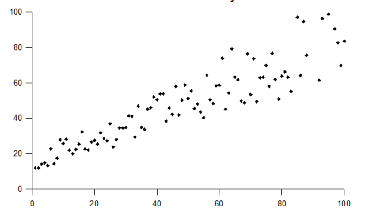
To visualize the math behind OLS, let’s take a look at a scatterplot of life expectancy vs schooling.
final_df %>%
  ggplot(aes(x = schooling, y = life_expectancy)) +
  geom_point() +
  labs(
    title = "Figure 1: Life Expectancy vs Schooling"
  )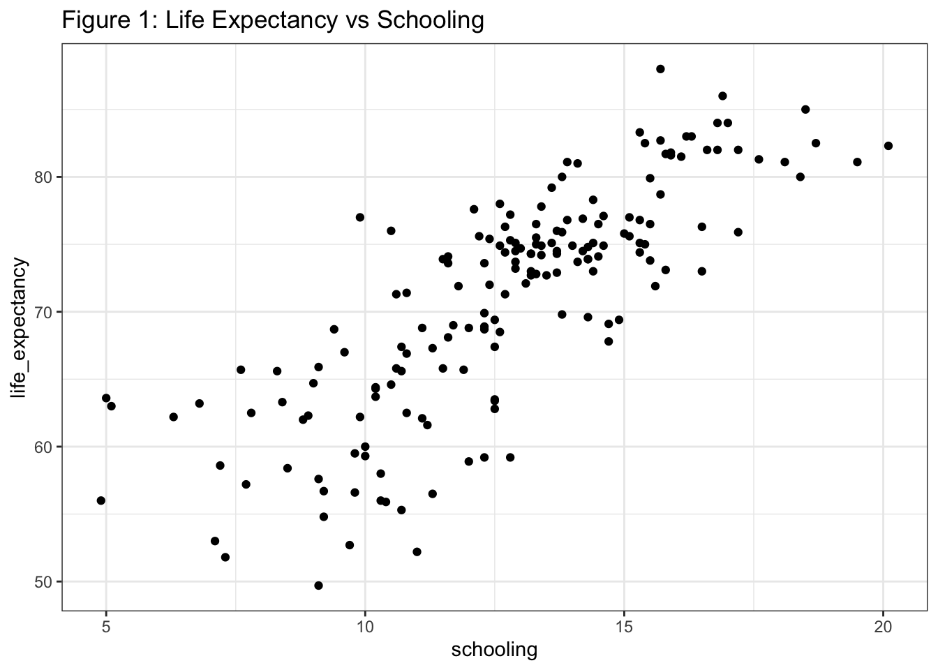
We have a pretty linear relationship with potentially some heteroscedasticity, which we’ll talk about in the assumptions section below. We’re going to ask R to fit a line through these data points and then we’ll break down how R came up with this line.
model_1 <-
  lm(data = final_df, life_expectancy ~ schooling)

summary(model_1)
##
## Call:
## lm(formula = life_expectancy ~ schooling, data = final_df)
##
## Residuals:
## Min 1Q Median 3Q Max
## -14.8459 -2.5066 0.3488 3.2111 12.4766
##
## Coefficients:
## Estimate Std. Error t value Pr(>|t|)
## (Intercept) 41.8211 1.7213 24.30 <2e-16 ***
## schooling 2.2932 0.1319 17.38 <2e-16 ***
## ---
## Signif. codes: 0 '***' 0.001 '**' 0.01 '*' 0.05 '.' 0.1 ' ' 1
##
## Residual standard error: 5.003 on 171 degrees of freedom
## Multiple R-squared: 0.6386, Adjusted R-squared: 0.6365
## F-statistic: 302.1 on 1 and 171 DF, p-value: < 2.2e-16The coefficients, also known as the “beta” terms, are our regression parameters: the intercept, \(b_0 \), estimated as 41.821 years, represents the average life expectancy in a theoretical nation where the average years of schooling was 0. This value is meaningless because there are no nations with this average education level and to interpret a regression line beyond the scope of the data that generated it is an epic no-no of cardinal sin magnitude. The slope, \(b_1 \), is estimated as 2.293, and represents the rate of change in life expectancy per additional year of schooling, give or take an error term, \(_i \). So on average, countries with one additional year of schooling add 2.293 years their average life expectancy.
Thus, from the “true” population model: \[ y_i = \beta_0 + \beta*x_i + \epsilon_i \]
we get our fitted model: \[ y = 41.821 + 2.293*x \]
Note that the F-statistic has a very small p-value (F = 302.1 on 1 and 171 DF, p-value: < 2.2e-16). This means that our model is statistically significant. But since we only have one predictor term, the statistical significance of the model is same as the significance of the predictor term,schooling in this model.
To visualize the line, we use geom_smooth with a method = “lm” argument:
final_df %>%
  ggplot(aes(x = schooling, y = life_expectancy)) +
  geom_point() +
  geom_smooth(method = "lm", se = FALSE) +
  labs(
    title = "Figure 2: Fitted Model"
  )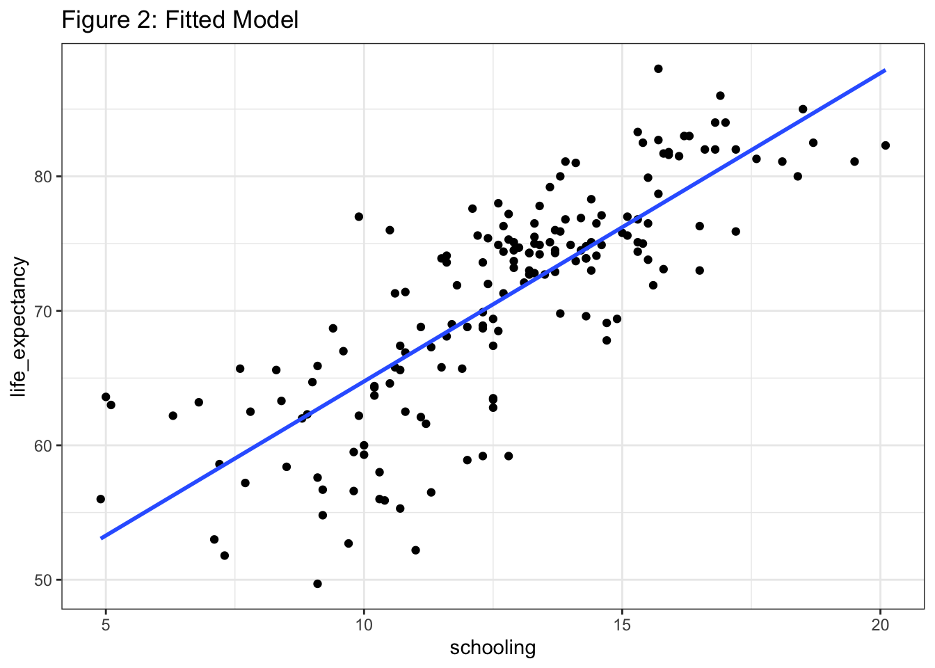
We want to look closely at the distances between the datapoints and the line. Unfortunately, lm() doesn’t give us a dataframe output we can work with. This is where the broom package comes in handy. Specifically, the augment() function within broom allows us to build a dataframe with all kinds of useful information:
model_1_df =
  broom::augment(model_1)
model_1_df
## # A tibble: 173 × 8
## life_expectancy schooling .fitted .resid .hat .sigma .cooksd .std.resid
## <dbl> <dbl> <dbl> <dbl> <dbl> <dbl> <dbl> <dbl>
## 1 59.5 9.8 64.3 -4.79 0.0117 5.00 0.00551 -0.964
## 2 76.9 14.2 74.4 2.52 0.00729 5.01 0.000936 0.505
## 3 75.1 14.4 74.8 0.257 0.00773 5.02 0.0000104 0.0516
## 4 56 10.3 65.4 -9.44 0.00987 4.96 0.0179 -1.90
## 5 75.9 13.8 73.5 2.43 0.00658 5.01 0.000789 0.488
## 6 75.9 17.2 81.3 -5.36 0.0197 5.00 0.0118 -1.08
## 7 74.4 12.7 70.9 3.46 0.00578 5.01 0.00139 0.693
## 8 82.3 20.1 87.9 -5.61 0.0436 5.00 0.0300 -1.15
## 9 88 15.7 77.8 10.2 0.0119 4.96 0.0253 2.05
## 10 71.9 11.8 68.9 3.02 0.00637 5.01 0.00118 0.605
## # … with 163 more rowsThe critical column here is the residuals vector, .resid, i.e. the vertical distances between the observed points and the fitted line. These values form the basis of regression modeling. To formalize, the residual (also known as the error term) is given as:
\[ \epsilon_i = Y_i - \hat{Y_i} \]
where the little hat on the Y indicates that it’s the model estimate, meaning the y-value of the point on the blue line.
If we were to look at just the data points, close one eye, and draw a line through them, we’d probably come with something close to the blue line R gave us. But while we would be using the complex machinery of our brain’s pattern-recognition capacity, the actual math behind the blue line is fairly straightforward. It all comes down to finding a line that optimizes these residuals. In fact, when we say “least squares”, we’re referring to minimizing the squares of these values. Let’s visualize them here using geom_segment():
model_1_df %>%
  ggplot(aes(x = schooling, y = life_expectancy)) +
  geom_point() +
  geom_segment(aes(xend = schooling, yend = .fitted), color = "red") +
  geom_smooth(method = "lm", se = FALSE) +
  labs(
    title = "Figure 3: Model Residuals"
  )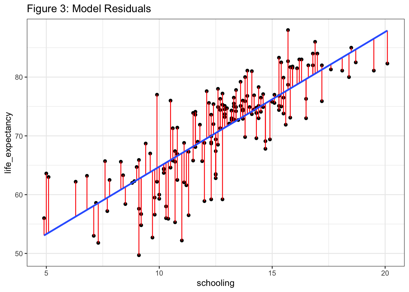
The red lines are the residuals and the way R computes the fitted model is by minimizing the squares of these red lines. The residuals are squared to avoid cancellation when adding positive and negative values.
OLS - Multi-variable Modeling
In the real world, we’re hardly ever working with just one predictor. The beauty of regression modeling lies in its flexibility - we can add as many predictors to the right side of the equation as we want, and they don’t need to be continuous variables. We can add categorical predictors using “dummy variables” (explained here). There is of course a trade-off in flexibility if you add tons of predictors, and generally speaking, you should only add predictors that make theoretical sense and keep your model parsimonious.
It should also be clear that when you add a second predictor, you’re no longer working in two-dimensional space. You need a third dimension to describe the relationship between the dependent and independent variables. You will also no longer be fitting a regression line, but a regression plane, which is very cool. We won’t make such a plane here, but you can find an example here.
Let’s take a look at our third variable, status, indicating whether the observation (nation) is considered developed or developing by the WHO’s definition. First, let’s do some visualization:
final_df %>%
  mutate(index = row_number()) %>%
  ggplot(aes(x = index, y = life_expectancy, group = status)) +
  geom_point(aes(color = status)) +
  labs(
    title = "Figure 4: Life Expectancy Difference by Status "
  )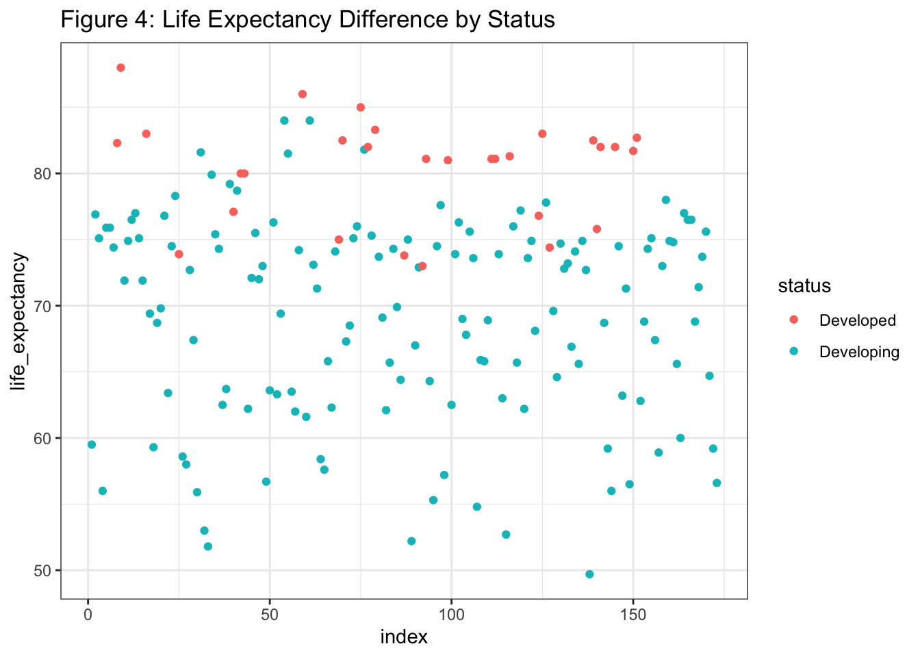
Clearly, countries in the developed world have higher life expectancy. But the question we want to answer is whether the relationship between schooling and life expectancy changes between developed and developing countries. In other words, if we fit a line using just the green points, and another using just the red points, would the slopes of those lines be different? And if so, how different? Regression modeling gives us an easy way to find out - all we need to do is add status as a predictor term:
model_2 =
  lm(data = final_df, life_expectancy ~ schooling + status)
summary(model_2)
##
## Call:
## lm(formula = life_expectancy ~ schooling + status, data = final_df)
##
## Residuals:
## Min 1Q Median 3Q Max
## -14.7545 -3.1520 0.5462 3.5773 12.4017
##
## Coefficients:
## Estimate Std. Error t value Pr(>|t|)
## (Intercept) 45.4937 2.7312 16.657 <2e-16 ***
## schooling 2.1420 0.1578 13.578 <2e-16 ***
## statusDeveloping -2.1010 1.2176 -1.725 0.0863 .
## ---
## Signif. codes: 0 '***' 0.001 '**' 0.01 '*' 0.05 '.' 0.1 ' ' 1
##
## Residual standard error: 4.975 on 170 degrees of freedom
## Multiple R-squared: 0.6448, Adjusted R-squared: 0.6406
## F-statistic: 154.3 on 2 and 170 DF, p-value: < 2.2e-16Again, the p-value on our F-statistic is significant, meaning that there is a statistically significant relationship between the outcome and the combination of predictors.
Our new model statement is:
\[ life_expectancy = 45.4937 + 2.1420*schooling - 2.1010*status \]
where the coefficient of the status variable indicates that, on average, after we control for schooling, there is a difference in life expectancy of 2.1 years between developing and developed countries. However, note that the p-value for the status predictor is 0.08 (p > 0.05), meaning that controlling for education, status is not a significant predictor of life expectancy. This does not mean that status alone is not a significant predictor of life expectancy. It just means that after we control for education by putting it in the model, the effect of status mostly washes away.
To illustrate:
model_3 = lm(data = final_df, life_expectancy ~ status)
summary(model_3)
##
## Call:
## lm(formula = life_expectancy ~ status, data = final_df)
##
## Residuals:
## Min 1Q Median 3Q Max
## -19.408 -5.408 1.307 5.592 14.892
##
## Coefficients:
## Estimate Std. Error t value Pr(>|t|)
## (Intercept) 80.393 1.330 60.456 < 2e-16 ***
## statusDeveloping -11.285 1.458 -7.742 8.17e-13 ***
## ---
## Signif. codes: 0 '***' 0.001 '**' 0.01 '*' 0.05 '.' 0.1 ' ' 1
##
## Residual standard error: 7.161 on 171 degrees of freedom
## Multiple R-squared: 0.2596, Adjusted R-squared: 0.2552
## F-statistic: 59.94 on 1 and 171 DF, p-value: 8.169e-13Clearly, status is a highly significant factor in life expectancy when considered by itself. This is even clearer in a plot:
final_df %>%
  ggplot(aes(x = status, y = life_expectancy)) +
  geom_point() +
  stat_smooth(method = "lm", se = FALSE) +
  labs(
    title = "Figure 5: Status vs Life Expectancy"
  )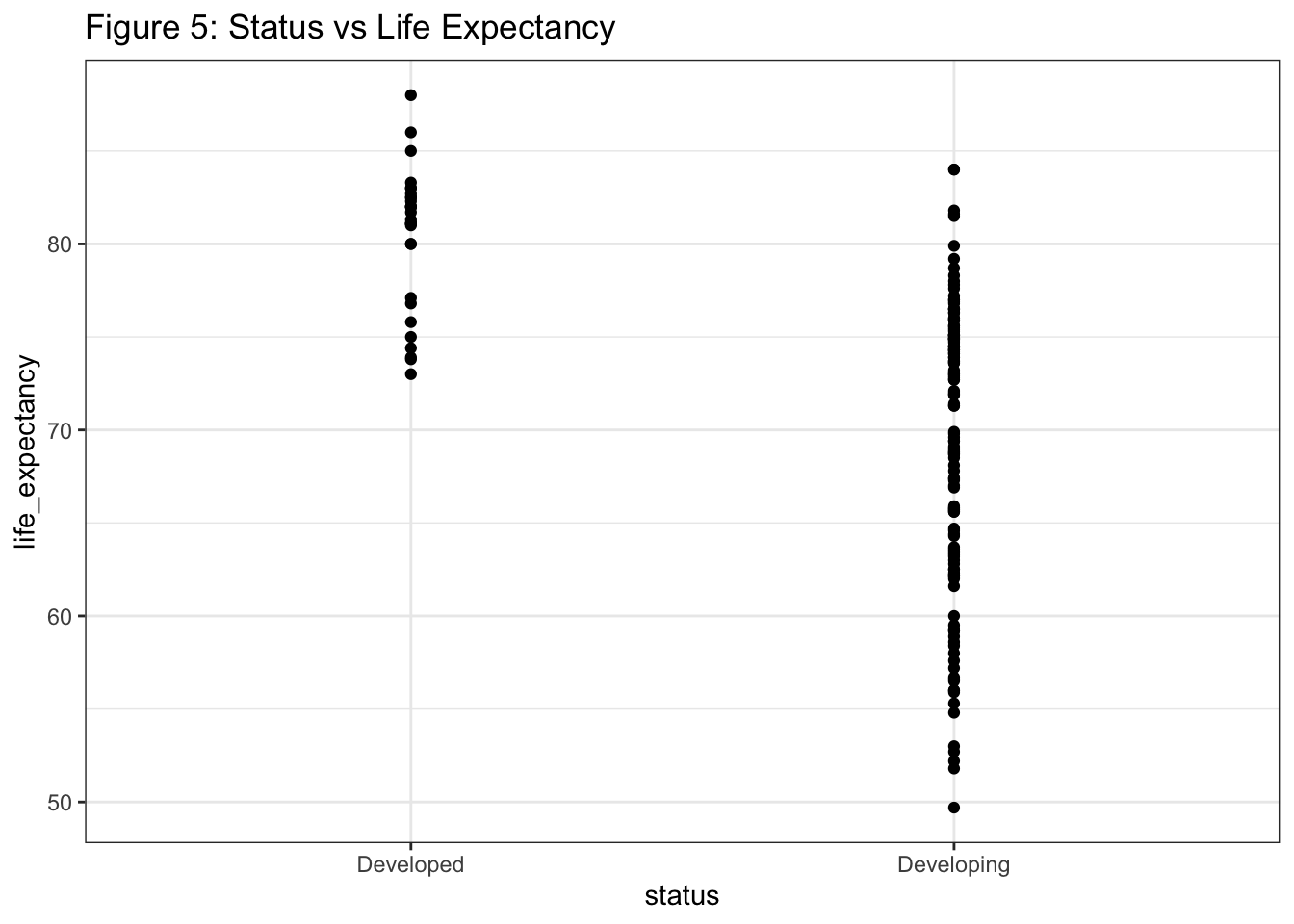
What the p-value for status in model_2 does tell us is that the relationship between schooling and life expectancy does not change significantly between developed and developing countries. Again, to visualize:
final_df %>%
  ggplot(aes(x = schooling, y = life_expectancy, group = status)) +
  geom_point(aes(color = status))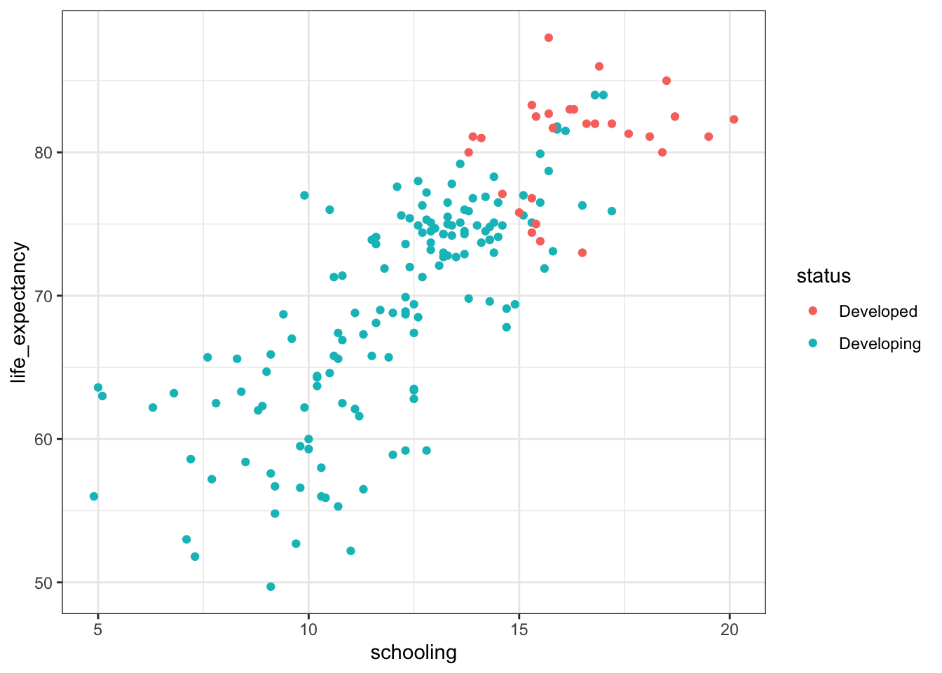
The point is that even though we have two distinct clusters, the regression line is more or less the same between them.
For our purposes, we’re going to take all of this to mean that we should get rid of the status term in our model. This is not to say that all predictors with p-values < 0.05 don’t belong in your model. We’re not going to go down that rabbit hole, but you can find people arguing the matter at length on stackexchange. This is just a decision I’m making based on the evidence.
So now that we’ve settled on model_1, how do we figure out how “good” it is? That’s where regression diagnostics come in.
Step 2: Figure out how “good” your model is
Smith et al (2017) describe regression diagnostics as an “art”, referring to the absence of a structured process for model evaluation. After looking through a digital bushel of papers, I would have to agree. If you spend any time looking at scientific work employing linear regression models, you’ll be hard-pressed to find any consistency in the measures scientists use to evaluate their models (if they use such measures at all).
However, it’s clear that simply fitting a linear model is not enough. While there are many different constructs and measures to evaluate model performance, I would like to, at minimum, understand the magnitude of a model’s error, its predictive capacity, the impact of outliers and influential observations, and whether it meets the assumptions for linear modeling in the first place. We’ll look at this last topic in the next section.
First, let’s look at perhaps the most common model diagnostic, \(R^2\), or, more formally, the coefficient of determination. For a single-variable model, \(R^2\), is just the square of our friend, the Pearson correlation coefficient. It turns out that this is actually a much more useful quantity:
\[ R^2 = \frac {\Sigma_{i=1}^n (y_i - \hat y_i)^2} {\Sigma_{i=1}^n (y_i - \bar y_i)^2} \]
\( R^2 \) is powerful because it’s completely intuitive - it equals the percentage of variance in the outcome explained by the predictor(s). This is part of the summary() output:
summary(model_1)##
## Call:
## lm(formula = life_expectancy ~ schooling, data = final_df)
##
## Residuals:
## Min 1Q Median 3Q Max
## -14.8459 -2.5066 0.3488 3.2111 12.4766
##
## Coefficients:
## Estimate Std. Error t value Pr(>|t|)
## (Intercept) 41.8211 1.7213 24.30 <2e-16 ***
## schooling 2.2932 0.1319 17.38 <2e-16 ***
## ---
## Signif. codes: 0 '***' 0.001 '**' 0.01 '*' 0.05 '.' 0.1 ' ' 1
##
## Residual standard error: 5.003 on 171 degrees of freedom
## Multiple R-squared: 0.6386, Adjusted R-squared: 0.6365
## F-statistic: 302.1 on 1 and 171 DF, p-value: < 2.2e-16For the single-variable model, \( R^2 = 0.6386 \), so 63.86% of the variance in a nation’s life expectancy can be explained by its linear relationship to education. For a single variable model, this is a pretty high \( R^2 \). Note that when we fit model_2, the \( R^2 \) only went up to 64.48%, all while taking away a degree of freedom from the model - further evidence that status is not a worthwhile predictor in this context.
To quantify the model’s error, which, again, comes down to residuals, we can look at Root Mean Square Error (RMSE), another highly common regression diagnostic. It is defined as:
\[ RMSE = \sqrt \frac {\Sigma_{i=1}^n (\hat y_i - y_i)^2} {n} \]
and as you might intuit from the formula, RMSE is a measure of the standard deviation of residuals. RMSE can be computed using the metrics package, or just using a quick manual calculation:
sqrt(mean(model_1_df$.resid^2))## [1] 4.97418Our calculated RMSE of 4.974 indicates that actual life expectancy deviates from life expectancy predicted by the model by about 5 years, on average.
Another way to assess model performance is to figure out whether it was influenced by a small set of influential observations. Perhaps our model started out as a perfectly nice model, chugging along, predicting stuff with few mistakes. But then it came across some highly influential characters - data points that don’t hang with the pack, non-conformers, and they applied heavy influence and ultimately swayed our model off its course.
In truth, the study of outliers and influential observation is a whole thing and worthy of its own project. For now, let’s do two things. First, let’s look at Figure 2 and acknowledge that there’s not much visual evidence of outliers. Second, let’s do a quick check using Cook’s distance, .cooksd in our augment() dataframe.
Cook’s distance is a metric based on deleted residuals and is calculated for each data point in the set. It is a measure of the difference that would occur in our predicted values if we were to re-run the regression model without that point. Let’s look at the Cook’s distances in model_1:
model_1_df %>%
  arrange(desc(.cooksd)) %>%
  inner_join(lifexp_df, on = life_expectancy) %>%
  head()
## # A tibble: 6 × 28
## life_exp…¹ schoo…² .fitted .resid .hat .sigma .cooksd .std.…³ country year
## <dbl> <dbl> <dbl> <dbl> <dbl> <dbl> <dbl> <dbl> <chr> <int>
## 1 63.6 5 53.3 10.3 0.0473 4.95 0.111 2.11 Eritrea 2012
## 2 63 5.1 53.5 9.48 0.0462 4.96 0.0912 1.94 Niger 2012
## 3 49.7 9.1 62.7 -13.0 0.0149 4.92 0.0518 -2.62 Sierra… 2012
## 4 77 9.9 64.5 12.5 0.0113 4.92 0.0360 2.51 Bangla… 2012
## 5 52.2 11 67.0 -14.8 0.00785 4.89 0.0351 -2.98 Lesotho 2012
## 6 52.7 9.7 64.1 -11.4 0.0121 4.94 0.0321 -2.29 Congo 2001
## # … with 18 more variables: status <chr>, adult_mortality <int>,
## # infant_deaths <int>, alcohol <dbl>, percentage_expenditure <dbl>,
## # hepatitis_b <int>, measles <int>, bmi <dbl>, under_five_deaths <int>,
## # polio <int>, total_expenditure <dbl>, diphtheria <int>, hiv_aids <dbl>,
## # gdp <dbl>, population <dbl>, thinness_1_19_years <dbl>,
## # thinness_5_9_years <dbl>, income_composition_of_resources <dbl>, and
## # abbreviated variable names ¹life_expectancy, ²schooling, ³.std.residWe can see that our top five most influential observations are Eritrea, Niger, Sierra Leone, Bangladesh, and Lesotho. To complement using a quick visualization:
model_1_df %>%
  mutate(id = row_number()) %>%
  ggplot(aes(x = id, y = .cooksd)) +
  geom_point() +
  theme_bw()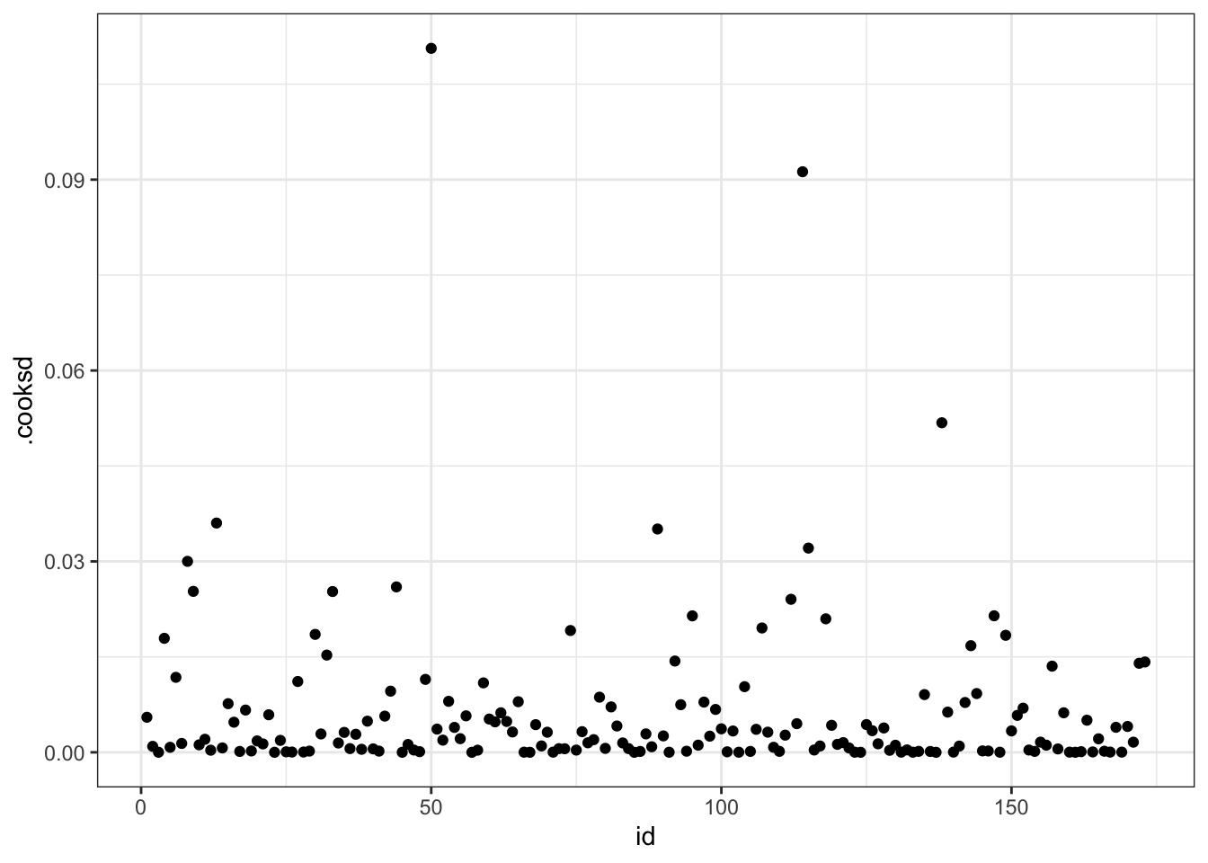
We see three points (Eritrea, Niger, Sierra Leone) that stand out from the pack. These observations are not just outliers, but influential outliers, meaning they swayed our model towards themselves, compromising its predictive capability.
So what do we do with them? You can find lots of different “rules of thumb” online, dictating which Cook’s distance might prompt removal of a data point from your set, but what makes most sense to me in this situation is to accept the data as they are. We don’t have any super high leverage points here, and even if we did, we would need justification for removing them. As you can probably intuit, few natural processes are simple enough to be accurately explained by a linear model. Hence the discovery/invention of more sophisticated probabilistic models and machine learning.
Step 3: Validate Regression Assumptions
Now that we’ve done all this work, we need to figure out whether any of it was worthwhile. This is a bit of a nuisance with linear regression - you can’t really check the assumptions before you fit the model because you need the model to know if the assumptions were satisfied.
You’ll often see regression assumptions summarized as follows: 1. Linearity: If the data aren’t linear, don’t fit a linear model. We looked at the scatterplot in step 1 and found it was pretty linear. 2. Independence: Observations shouldn’t be clustered or have any influence on other observations. It’s hard to say this is the case in our situation, since it’s pretty clear that developing countries and developed countries cluster together and through political and economic means influence their neighbors’ policies and practices. 3. Normality of residuals: If you look at the residuals in Figure 3 and superimpose little sideways bell curves along the regression line, you should see that the residuals are normally distributed. Basically, the majority of the residuals are located close to the line and a few are found further away. This is best explained visually:
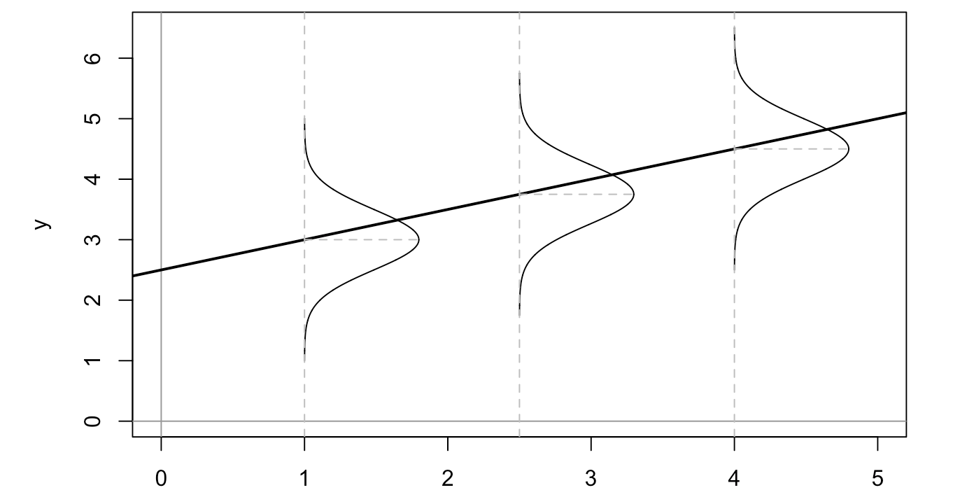
It looks like this is generally the case for our model, using the trusty eyeball method. 4. Homoscedasticity 1: Homoscedasticity means that the variance of the residual terms is somewhat constant. If your data are heteroscedastic, linear regression modeling is probably not a good choice. Again, this is better visualized:
When we first looked at our data in scatterplot form above, we noted some definite heteroscedasticity. Let’s look at it again:
final_df %>%
  ggplot(aes(x = schooling, y = life_expectancy)) +
  geom_point() +
  geom_smooth(method = "lm", se = FALSE) +
  labs(
    title = "Life Expectancy vs Schooling"
  )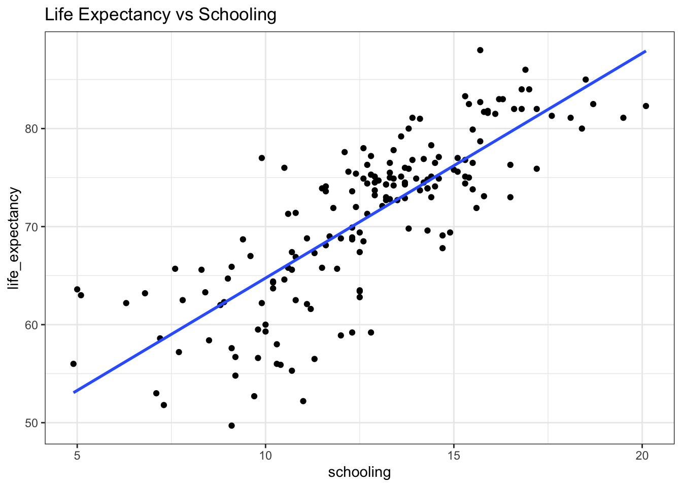
Below 10 years of schooling, our residuals are much wider than on the other side of 10. There might be some intuitive explanation for this observation. For instance, it’s possible that there’s a distinction between countries where a majority of the population finishes what is considered high school in the US and in countries where that isn’t the case, years of schooling doesn’t matter as much as other factors - like access to clean water and nutritious foods.
All in all, checking regression assumptions convinced me that linear regression is not really the best choice here. But on the bright side, we learned some good fundamental principles about how statistical modeling works.
Conclusions
Hopefully you learned a bit about ordinary least squares regression and how to evaluate simple regression models. After going through a fairly brief analysis, we learned that:
- Globally, the relationship between life expectancy and education based on WHO data is fairly linear, with a simple modeling resulting in an \(R^2 \> of 0.64.
- Few influential outliers were present in the data.
- In order to build a more robust model, data should be limited to a range where the linear regression assumptions (namely, homoscedasticity) are met. Otherwise, a more robust modeling strategy should be used.
Further Reading
- In-depth overview of regression modeling with different types of predictor variables
- Good intro to model selection
- Explanation of differences between RMSE, \( R^2 \), and other measures of model error
- A nice interactive OLS explainer
- Everything you ever wanted to know about residuals: https://drsimonj.svbtle.com/visualising-residuals
- Great lecture on outliers
References
- Jenkins-Smith, H. C. (2017). Quantitative Research Methods for Political Science, Public Policy and Public Administration (With Applications in R): 3rd Edition. University of Oklahoma
- Field, A. P., Miles, J., & Field, Z. (2012). Discovering statistics using R. Thousand Oaks, CA.
If you’re a spelling bee organizer, I recommend adding this word (mostly because I still misspell it almost every time I write it).↩︎


